Evolving our Logo into a Brand…
28th February 2020
Written by Classroom Secrets
As you’ll be aware, companies rebrand all the time, for a myriad of reasons; perhaps the company has changed in some way, it may have grown significantly, or be launching a new product, or be attracting new audiences.
Our reasons included a combination of the above. When Classroom Secrets was launched in 2013, it was operated entirely by two people; our founders, Claire Riley and Ed Riley. Nowadays, Claire and Ed are joined by over 60 colleagues, and our reach is far and wide. We have customers in 22 countries (with plans for more) and a product range that is expanding all the time. As well as our core Classroom Secrets product, we now also have an interactive product for KIDS, our own podcast, and a new charitable foundation.
Seven years ago, when our original logo above was created, nobody could have envisaged where and how it would need to be used. Over time, we have grown to require a brand that can be used across web and mobile devices, in animations, in print, at small scale and large: a brand that better conveys who we are and which makes us more easily identifiable to our current and future customers.
Our original logo did amazingly well for us for 7 years: it has seen us through a huge period of growth and many people will be fond of it. We personally love the logo, but as we grow even more, we feel now is the right time to evolve.
The main reason for this is because the old brand actually wasn’t a brand – it was a logo. We never had a set of brand guidelines, a colour palette, a font, an illustration or photography style, or a graphic designer – we do now though! Hello, I’m Lewis, pleased to meet you – meaning that when you saw us out in the wild, it was almost impossible to identify us! Take a look yourself:
The colour palate was limited to its two colours – dark red and orange. This didn’t give us much scope when it came to the design of the website, and everything was orange, red or blue (borrowed from The Teachers’ Podcast).

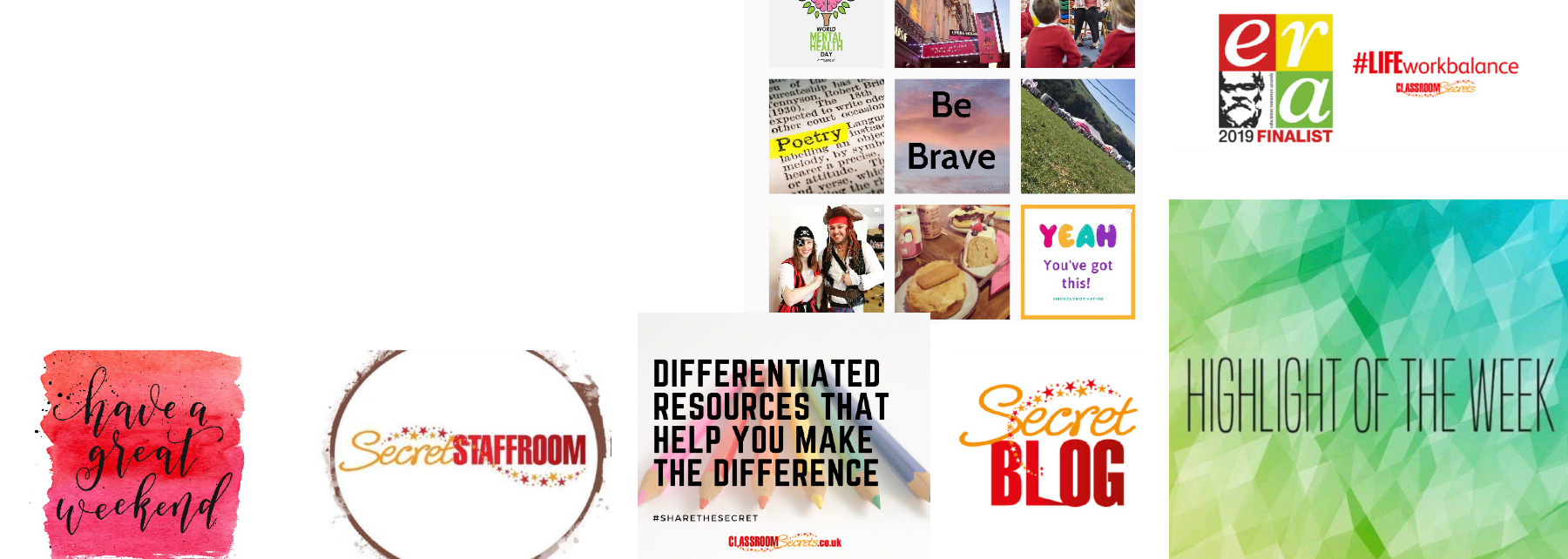
The logo itself was an intricate design: it had bold text in all caps; light scripted text in sentence case; 77 individual stars scattered through it; and a door handle in the letter ‘L’… the door into our ‘secrets’. When the logo was used in small scale (such as at the bottom of resource sheets, in website headers, favicons or app icons) these important details were lost.
So this is what led us to the decision to make some changes. Starting with this logo. We believe it is a more refined version of the original, which still maintains its spirit but is better suited to lead our company into the new decade. The design is simple and clear, and the details are still recognisable in a small scale. It also has a new colour palette which can be used in many more places.
The logo is just the figurehead though, and you will be able to see the brand at work across all of our materials. Many things will have changed already, and over the coming months you’ll see other visuals around Classroom Secrets and our other brands aligning with this new direction. This includes the website, our resources, in marketing and advertising, and across our social media platforms.
This is just the beginning, but don’t worry – we’re still Classroom Secrets and we will still provide you with choice, quality and balance.


Try us today!