Graphic Organisers - Introduction to Charts
3rd September 2025
Written by Chris Hyde
Graphic organisers are a brilliant way to help children make sense of how different pieces of information connect together — you’ve probably used a concept map within a lesson at some point but there’s a whole world of graphic organisers beyond concept maps waiting to be explored. In this series of blogs, we’ll dive into five different types of graphic organisers and how they can slot seamlessly into your classroom practice. We’ve even thrown in handy links to downloadable versions to save you precious planning time!
Before we get into the “what” and “how”, let’s clarify exactly what a graphic organiser is. In short, it’s a visual tool that breaks a topic down into its key ideas and shows how they link together. Their strength lies in their versatility and how they can pop up in every subject; whether it’s comparing number properties in maths, sorting true or false statements about a text in English or exploring similarities and differences between places in geography, graphic organisers bring clarity to complex content.
They’re not just popular because they look neat on a display board. They’re backed by research too — recommended in multiple EEF Improving Literacy guidance reports, cited by The Bell Foundation as making curriculum content more accessible for EAL learners and endorsed by SENsible SENCo as a valuable aid for students with cognitive difficulties. By stripping away language barriers to boil information down to its key points (rather than within a sentence that must follow grammar rules), information is shown rather than told.
In the classroom, they’re as flexible as your favourite lanyard: use them during whole-class discussions to clarify understanding, in plenaries to review learning, for retrieval practice or in group work to encourage oracy and collaboration. One quick note — don’t confuse them with knowledge organisers. While both are useful tools, knowledge organisers give you all the key facts from a unit on one page, while graphic organisers help pupils make sense of how that knowledge connects.
In this first graphic organiser blog, we are going to focus on charts and tables. These allow information to be sorted into two columns so that contrasts between the data can be seen, and often crop up in assessments such as: sorting statements into whether they are true or false; whether items about a piece of writing are fact or opinion; or developing a point with evidence to support it. These questions can prove tricky for some children during assessments so building these into regular classroom practice is vital for familiarity.
Here's an example of a classic T-chart (so-called because of the row at the top then the line dividing the two columns making a T-shape, fact fans) being used for a Year 2 science lesson on the uses of everyday materials:
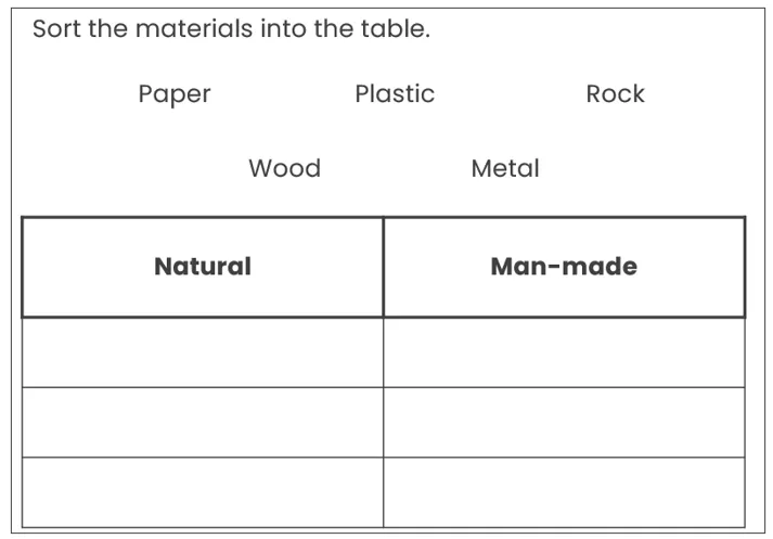
So far, so simple! Children need to consider the headings in the table and the properties of what items are being sorted to ensure they are placed into the correct column within the chart and nowhere else.
This one has a potential misconception too, with ‘metal’ being seen as man-made for its everyday uses but a naturally occurring substance. Another problem that some children may run into is that there are five items to be sorted but there are six cells; it is important for them to know that an empty cell is fine.
The completed T-chart should end up looking like this:
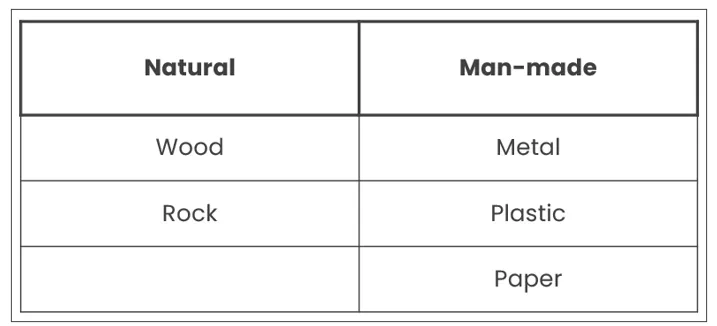
Children need to understand that the order within the columns does not matter – as long as the items have been sorted into the correct column, their order is irrelevant. It is also vital that children are aware that the column headings are key for sorting the items accurately; in this example, if the headings had been ‘materials that begin with the letter P’ and ‘materials that don’t begin with the letter P’, the T-chart would have to have been completed differently.
T-charts can also be comprised of two columns that are not split up into individual cells, which could make sorting information more complicated but may be more suitable for the needs of some children. Both types, along with A5 versions, are available on our website in both editable and non-editable formats.
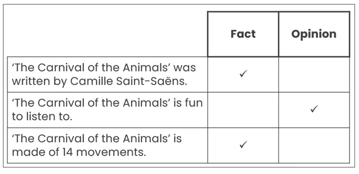
Another chart is ticking statements based on whether they are true or false; fact or evidence; or a different criterion, such as ticking whether specific plants are flowering or non-flowering. Whichever flavour it comes in, this chart is easier to complete as it’s simply ticking but two pieces of data must be considered to ensure that tick is put in the right option (the headings and each statement that is being marked against the headings).
Below is an example of a true or false chart for a Key Stage 2 art lesson about Van Gogh:
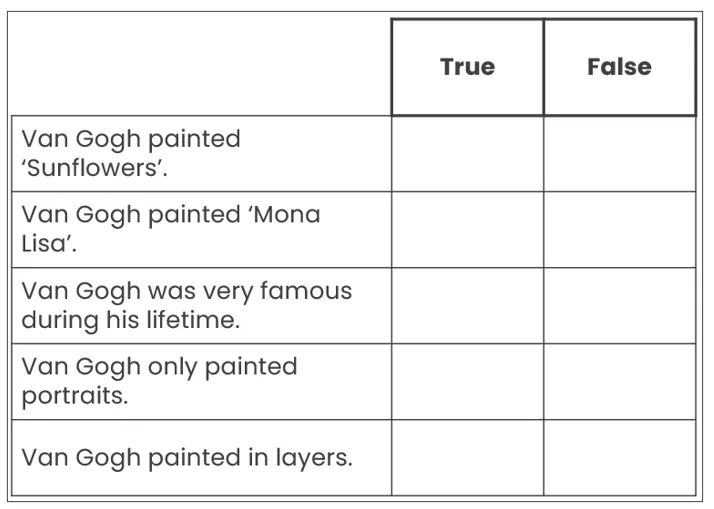
Note that the statements in this table draw upon aspects of Van Gogh’s life, rather than just his art, to achieve the appropriate National Curriculum statement but there are many statements that could have been used. The statements have also been chosen to ensure plausible distractors, which means that it is not immediately clear whether some of them are true or false and children have to think more deeply about their learning to complete the chart (if a statement said ‘Van Gogh’s favourite singer is Taylor Swift’, for example, it would be clearly false and no critical thinking would take place, although it might raise some awkward laughter).
This chart would ideally be used at the end of a lesson about Van Gogh’s life or as retrieval practice at the start of a following lesson, rather than being used cold before any learning has taken place.
Just in case you didn’t know much about Van Gogh, here’s the correctly-completed version:
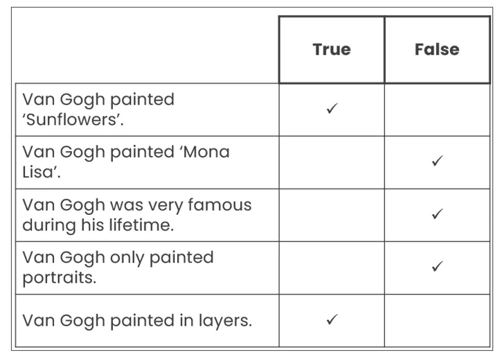
This example has five statements, which is more than usually seen in assessments. Our editable version (available here) can be adapted to reduce this for the needs of your class, or even extended! In terms of marking this, assessments traditionally have 2 marks for a true or false chart of four statements, with 2 marks awarded for getting all four correct and 1 mark for getting either two or three correct, depending on how generous the mark scheme is.
Again, it is worth stressing that the ticks would change placement if the statements were different or if the headings were ‘fact’ or ‘opinion’ – children need to think about the statement and the criteria it is being compared against.
Below are completed examples of variations on this type of chart, which are also available in our online templates, applied to Key Stage 2 music and Key Stage 1 geography:
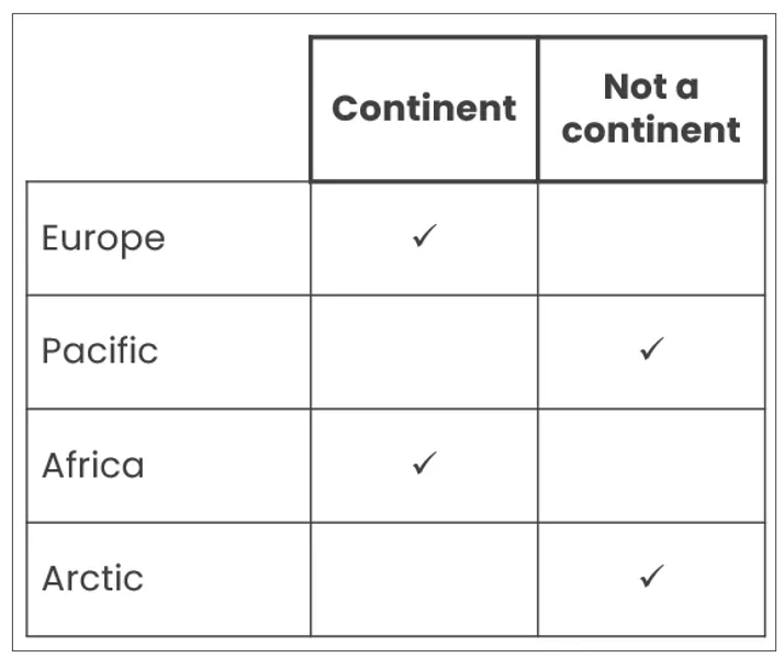
All three variations, along with A5 versions, are available on our website in both editable and non-editable formats.
The final type of chart is the most challenging of all, and not something typically seen outside of Year 6 reading assessments – point and evidence charts. Using the same format as a T-chart, children must write the point they are making in the left-hand column and then what evidence quantifies it in the right-hand column. This is typically used to check deeper understanding of a text after it has been read, such as what details can be inferred.
For example, let’s assume that children have read the following paragraph as part of a longer text and must then answer the question below:
Omar sighed and closed the door behind him. Pulling his threadbare hat further over his ears, he trudged through the rapidly-falling snow towards his car, leaving the warmth and safety of his house behind him. When he reached his work, he ignored the cheery greetings of his co-workers and instead slumped at his desk.
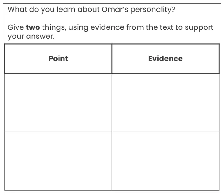
In these three sentences, we don’t learn a great deal about Omar and the writer hasn’t explicitly told us about his personality. Instead, what information has been given must be considered to think about what can be inferred about his personality. This is complicated in and of itself, but recording that inference within a table (and ensuring that the right information goes into the right cell) adds another layer of complication. As this type of chart is frequently seen in SATs, familiarity with completing these during reading work in Year 6 would be beneficial, especially as these are often worth three marks.
This example could be answered as follows:
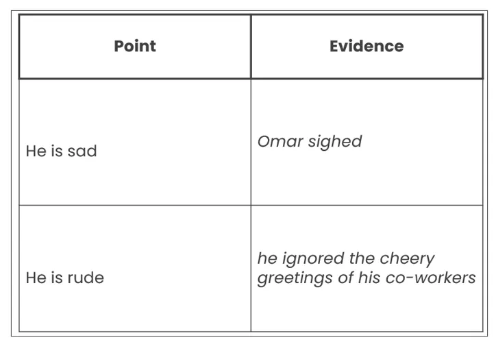
As always, the column headings must be considered as it may not always be ‘point’ at the top of the left column, along with the instructions for these ones as they often direct children to where to look within the text.
Within the downloadable templates are standard and A5 versions of both a regular one of these (as seen above) and one with handwriting lines supplied, available in editable or non-editable formats.
As shown in the examples, charts can be used across the entire primary curriculum to contrast two sets of data. As graphic organisers, they are an essential tool for helping children organise, compare and reflect on information in a clear and structured way. Whether they’re sorting facts from opinions, ticking true or false statements or matching points to evidence, charts support deeper thinking through familiarity and routine use. By integrating these formats regularly into classroom practice (and tailoring them to your class’s needs), you not only demystify assessment tasks but also build confident and analytical thinkers. With editable templates ready to go, incorporating charts into your lessons has never been easier.
If this has sparked an idea on how you can use charts to develop your pupils’ thinking, remember to let us know at hello@classroomsecrets.co.uk as we would love to hear all about it! Our next blog in this series about graphic organisers will be about Venn diagrams so make sure you give that a read to develop your pupils even further.


Try us today!