Graphic Organisers - Carrol Diagrams
4th September 2025
Written by Chris Hyde
Welcome to the third blog in our series on graphic organisers!
Time to recap on what graphic organisers are via retrieval practice:
They are visual tools that break a topic down into its key areas and shows how they link together
They can be used across the curriculum
They are backed by research, such as in in multiple EEF Improving Literacy guidance reports, cited by The Bell Foundation as making curriculum content more accessible for EAL learners and endorsed by SENsible SENCo as a valuable aid for students with cognitive difficulties
They have the flexibility to be used throughout any lesson, such as whole-class discussions, plenaries, retrieval practice or group work for oracy and collaboration
This time, we are going to focus on Carroll diagrams, which allow data to be sorted into two categories based on binary yes/no options. Perhaps less well-known than its cousin the Venn diagram (covered in our previous blog), a Carroll diagram also compares similarities and differences in a visual way but it instead separates data when the sets are sorted. They were created by Lewis Carroll, the author of Alice in Wonderland, when he was working at Oxford University focusing on maths, hence the name. Let’s get graphical!
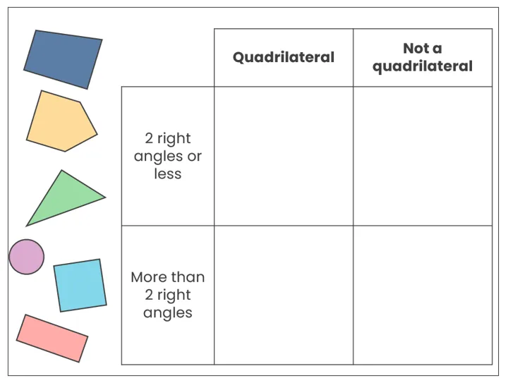
As with previous graphic organisers in this series, the first thing is to look at the headings to see how the items are being sorted. In this example, the top row is sorting the shapes based on whether they do or not have a specific attribute (whether they have exactly four sides or not). The left-hand column is sorting the shapes based on a different property but still using the yes/no approach. The headings cannot be open to interepretation and must be able to be answered using a true/false response.
Children should be taught to sort one item at a time so that they understand how to use these properties, which can be modelled (“OK, my first shape is a circle… does it go in the ‘quadrilateral’ column or the ‘not a quadrilateral’ column… definitely into the second of those columns so I know it goes into one of the cells on the right… does a circle have 2 right angles or less, or does it have more than 2 right angles… I can’t see any right angles in the circle so it must go in that row… the top-right cell is the one where both of the properties I’ve identified cross over so the circle must go there!”). This process can then be repeated for subsequent pieces of data, rather than trying to consider all properties of all items at once.
The ‘universe’ of a Carroll diagram means that all shapes can be sorted based on these four categories that arise from whether each one does or does not have each of the given properties (unlike a Venn diagram, where placing an object outside the circles is still an acceptable location to sort data).
By sorting the shapes using the binary categorisation of each field, this Carroll diagram would be completed as follows:
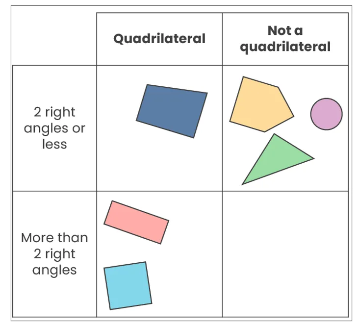
It is acceptable for there to be an empty cell, as in this example – the visual nature of a Carroll diagram means that we can instantly see that there are no shapes with more than 2 right angles that are not quadrilaterals from the ones that were supplied. This could then be used to promote deeper thinking:
What shape could go in the empty cell?
What do you notice about the shapes in the top-right cell?
Why is there only one shape in the top-left cell?
Why does the top-right cell have the most shapes?
Are there any other shapes that could go in the bottom-left cell, and why?
How would the Carroll diagram change if the shapes were different?
What other criteria could be used to sort these shapes, and how would the Carroll diagram change?
The use of two attributes means that patterns can be quickly spotted, especially with how many items from the data set go into each cell. Attention must be drawn to what the headings are, as always – if they were symmetrical/not symmetrical and has straight sides / has curved sides, the shapes would have to be sorted differently.
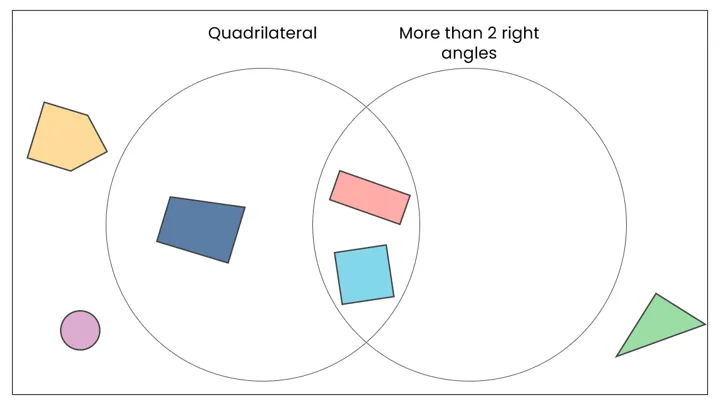
If you wanted to develop this even further, pupils could look at how the same data could be sorted into a Venn diagram with the same headings and what they notice about how the completed Venn diagram and Carroll diagram. A completed Venn diagram for the Carroll diagram above is below – what do you notice when comparing them?
Returning to Carroll diagrams, the data can be sorted in any way within those four cells – as long as the headings have been used to place the data correctly, their placement within those four cells is irrelevant. They are often used in maths, like sorting numbers based on multiples of 3 / not multiples of 3 and end in an even digit / end in an odd digit.
However, the visual nature of Carroll diagrams means they can be used to sort data across the curriculum beyond maths, such as:
English: sorting words, like adjective / noun and contains the ‘ai’ sound / does not contain the ‘ai’ sound;
Science: classifying materials based on their properties, like waterproof / absorbent and hard / soft;
Geography: comparing countries, like coastal / inland and in the Northern / Southern hemisphere;
History: sorting historical figures, like monarch / not a monarch and lived before / after 1600;
Art: classifying pieces of art, like 2D / 3D and use of organic / geometric shapes;
PE: comparing activities, like team / solo and involves equipment / no equipment needed;
PSHE: sorting behaviours, like safe / risky and online / offline; and
Music: classifying instruments, like string / percussion and high / low pitch.
The example used in this blog has been entirely visual with shapes, but words could be used instead. You could even get children to create a physical Carroll diagram to sort objects – give groups some chalk and objects, like rock samples, and take them onto the playground to construct their own Carroll diagrams to sort their samples. They could compare their different diagrams afterwards to see what properties were identified and how it impacted the categorisation – a fantastic deeper thinking opportunity!
Read more about retrieval practice here
To learn more about Venn Diagrams (covered in our previous blog), click here


Try us today!